Code
library(tidyverse)
library(ggplot2)

knitr::opts_chunk$set(echo = TRUE, warning=FALSE, message=FALSE)library(tidyverse)
library(ggplot2)
knitr::opts_chunk$set(echo = TRUE, warning=FALSE, message=FALSE)Read the data abot organic eggs’ price.
library(readxl)

eggs <- read_xls("_data/organiceggpoultry.xls",
                 sheet="Data",
                 range="B6:F125",
                 col_names = c("date", "xld", "xlhd", "ld", "lhd"))
eggs
# A tibble: 120 × 5
date xld xlhd ld lhd
<chr> <dbl> <dbl> <dbl> <dbl>
1 Jan 2004 230 132 230 126
2 February 230 134. 226. 128.
3 March 230 137 225 131
4 April 234. 137 225 131
5 May 236 137 225 131
6 June 241 137 231. 134.
7 July 241 137 234. 134.
8 August 241 137 234. 134.
9 September 241 136. 234. 130.
10 October 241 136. 234. 128.
# … with 110 more rows
# ℹ Use `print(n = ...)` to see more rowsI tried various methods, but I still couldn’t find a suitable method to change the year and month into one variable. So instead, I gave each row an order and tidy the data.
eggs<-eggs%>%
  mutate(order=1:120)
eggs
# A tibble: 120 × 6
date xld xlhd ld lhd order
<chr> <dbl> <dbl> <dbl> <dbl> <int>
1 Jan 2004 230 132 230 126 1
2 February 230 134. 226. 128. 2
3 March 230 137 225 131 3
4 April 234. 137 225 131 4
5 May 236 137 225 131 5
6 June 241 137 231. 134. 6
7 July 241 137 234. 134. 7
8 August 241 137 234. 134. 8
9 September 241 136. 234. 130. 9
10 October 241 136. 234. 128. 10
# … with 110 more rows
# ℹ Use `print(n = ...)` to see more rowsI drew a scatter plot of extra large dozen and large dozen.
ggplot(data=eggs)+
  geom_point(mapping=aes(x=xld, y=ld))+
  geom_smooth(mapping=aes(x=xld, y=ld))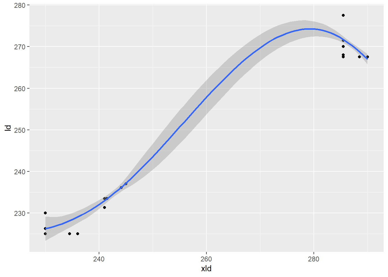
It looks like they have a strong relation.
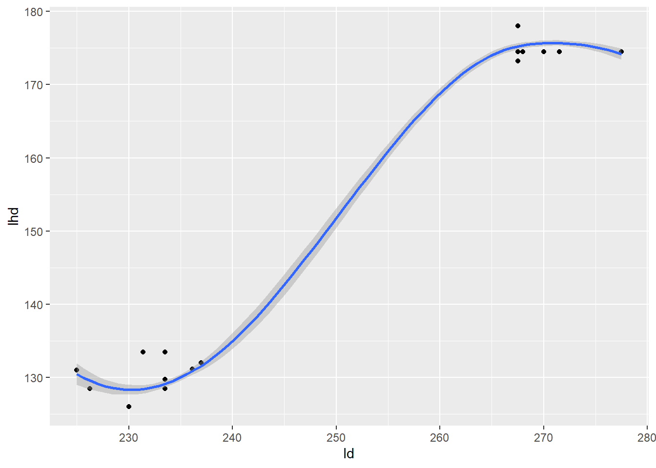
The relationship between extra large and its half, large and its half, also seems similar.
ggplot(data=eggs)+
  geom_point(mapping=aes(x=xld, y=xlhd))+
  geom_smooth(mapping=aes(x=xld, y=xlhd))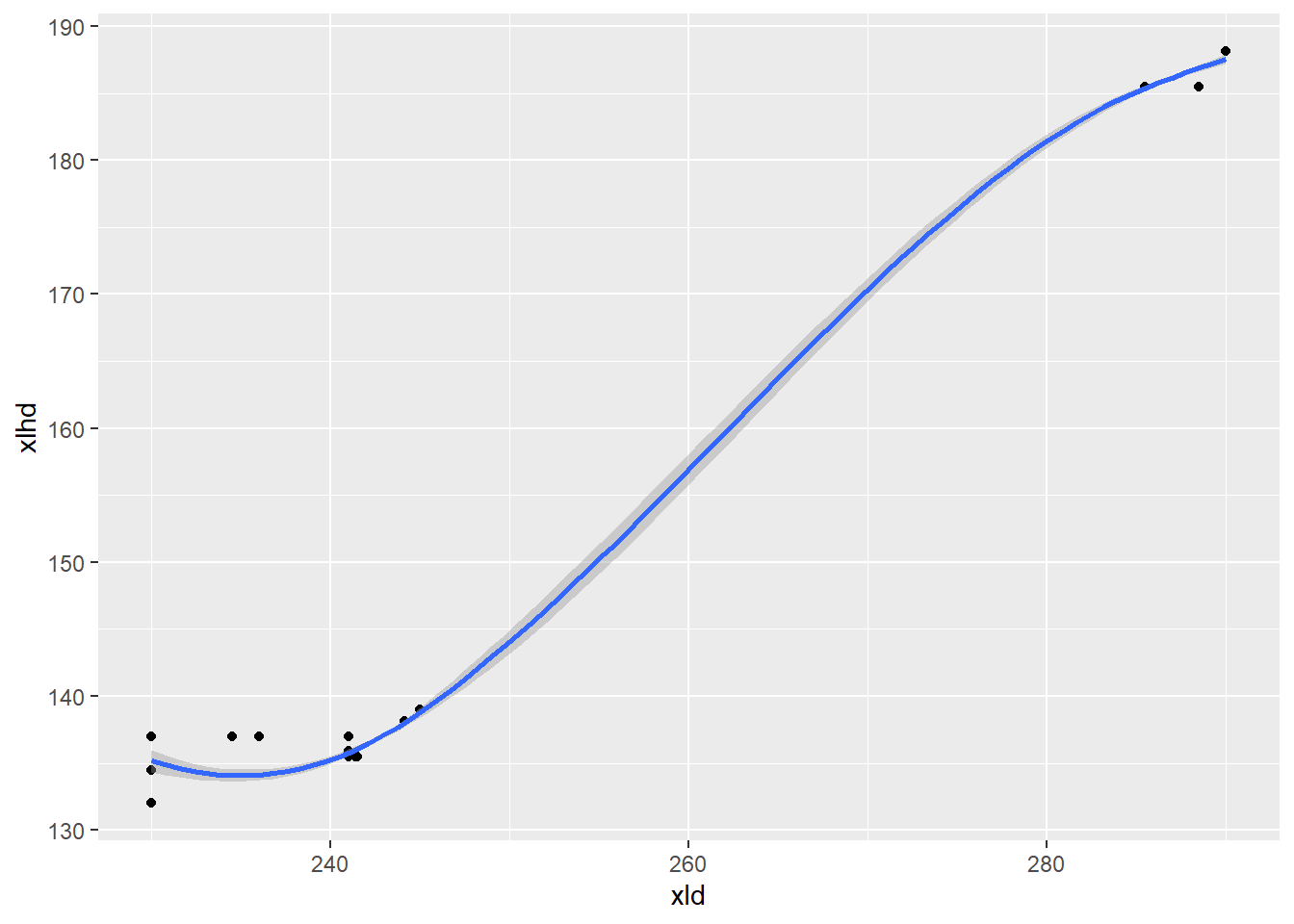
ggplot(data=eggs)+
  geom_point(mapping=aes(x=ld, y=lhd))+
  geom_smooth(mapping=aes(x=ld, y=lhd))